
Redesigning Navigation Page for an Internal Team at Amazon
Assignment l
Often I receive requests that are very broad, like this one to redesign the Amazon EHS WIKI page for a global launch of their new resources. The request was to make it look *fresh* and easier to navigate.
Problem 1. The communication assets were lacking a cohesive design between platforms and they did not have consistency over different locations around the globe.
Problem 2. The teams received a large number of trouble tickets requesting information that was already present on the pages. The page was outdated and was lacking a cohesive design between platforms.
Problem 1: Style Guidelines/ Brand Identity for EHS
Understanding the problem
Understanding the needs
Putting together all the different scenarios where they would need to have a guidelines to follow.
Defining visuals
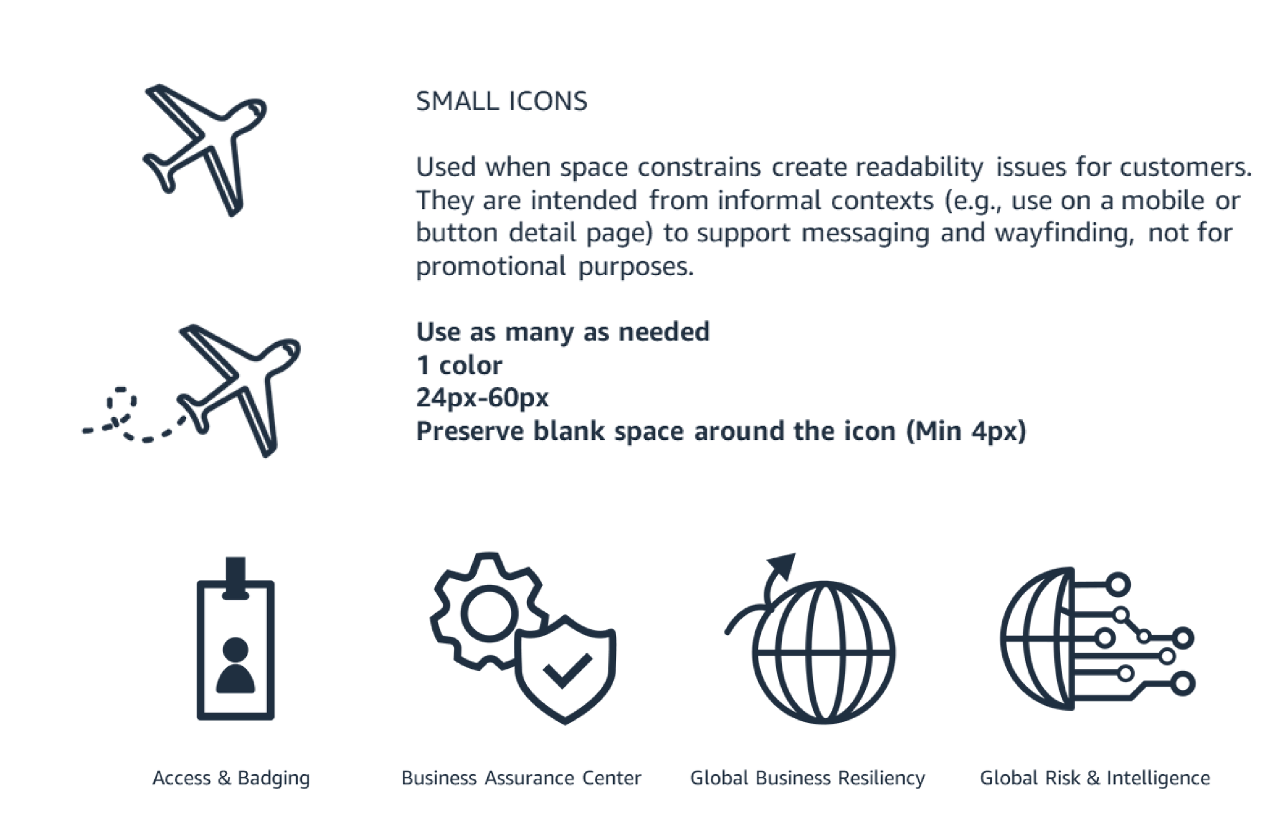
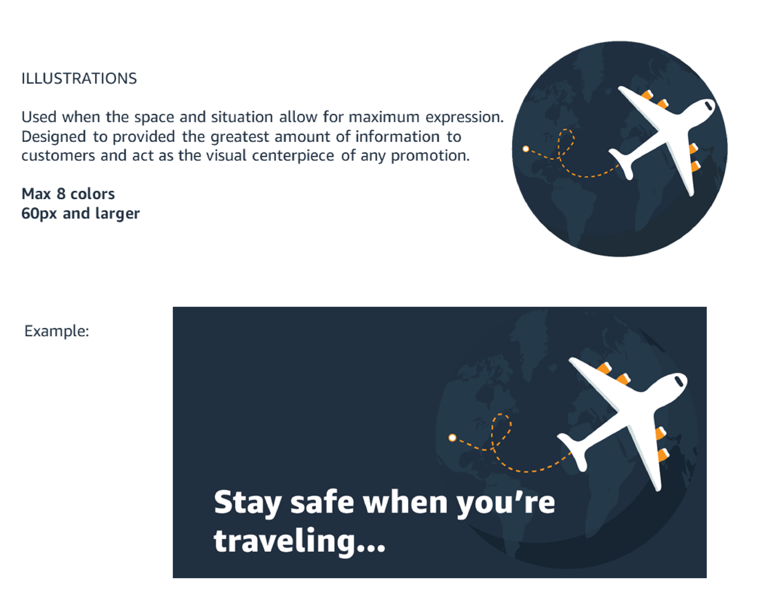
Look & feel - Icons & Illustrations Library
I settled on this style solution after considering the team's preference and researching the best options to reinforce an educational/friendly tone.
Ramp Color Palette from the Amazon Brand Color Palette.

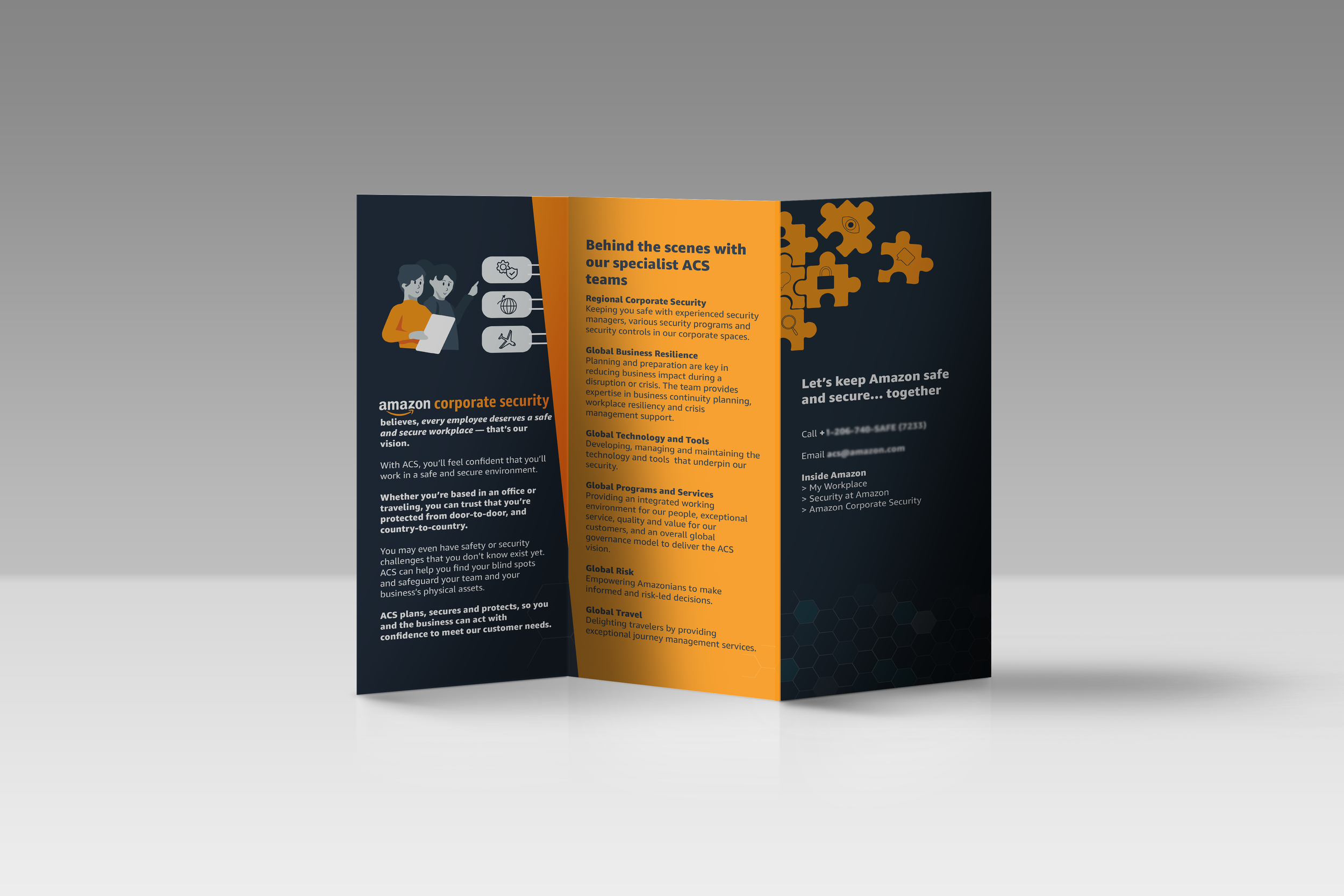
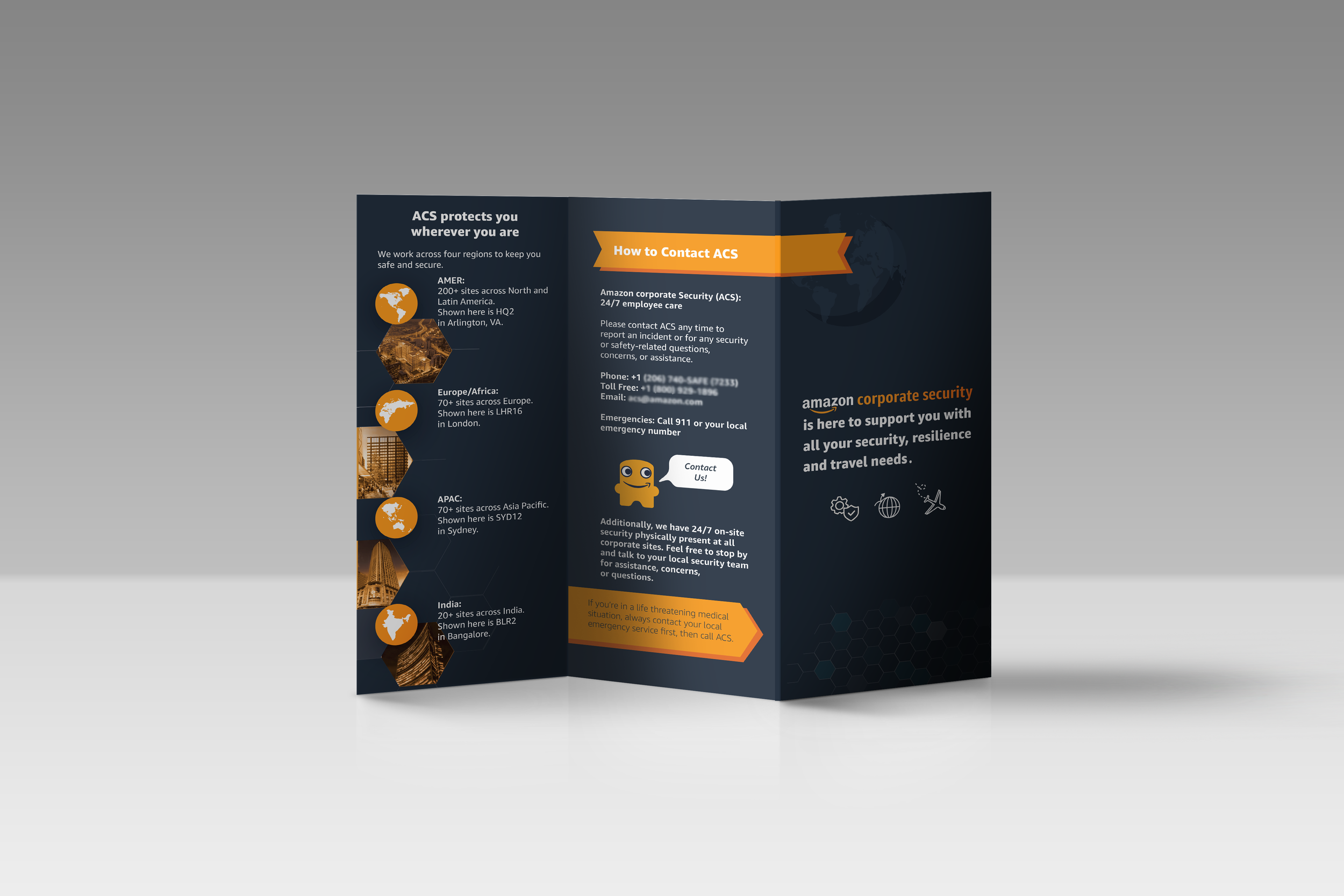
more SKETCHES & FINAL DELIVERABLES…


Guidelines/Global Audience
Lens of Scalability & Accessibility
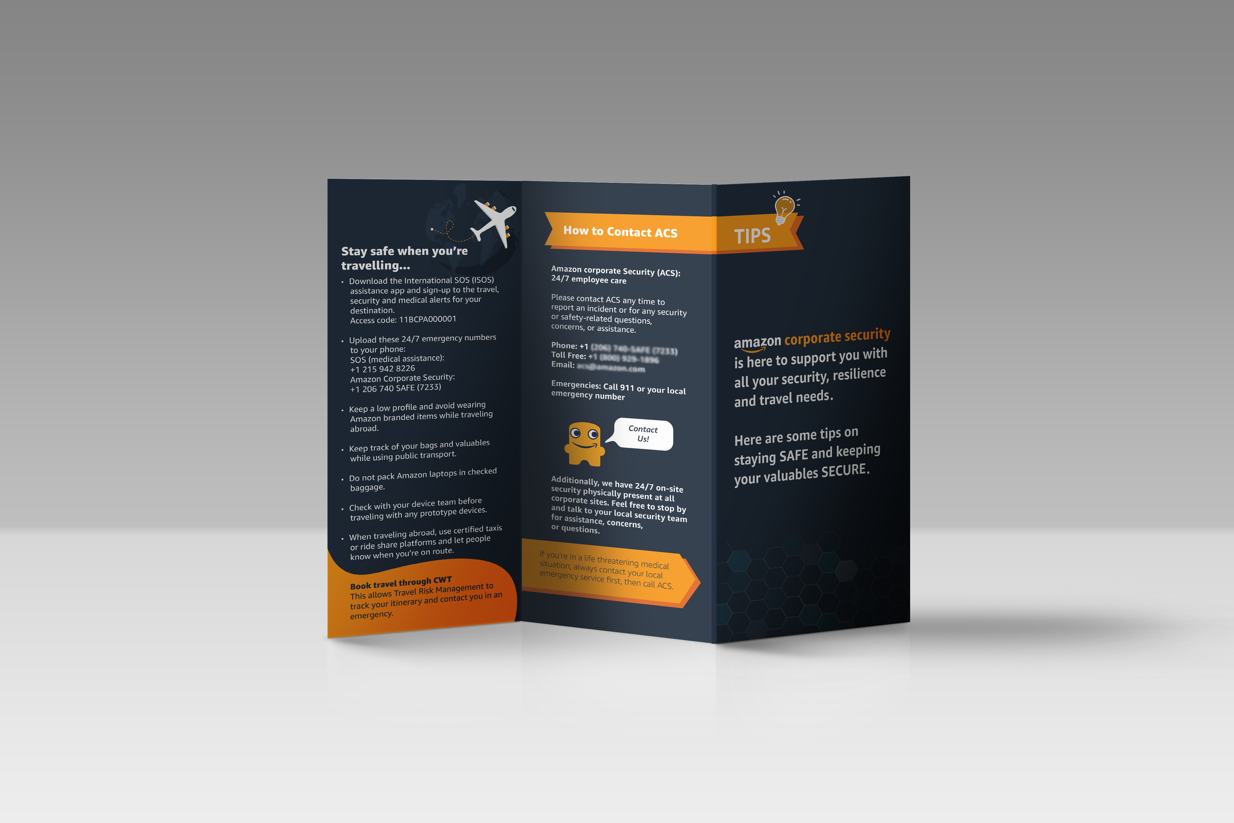
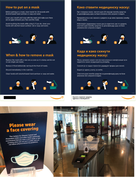
Posters
Convey the message with the fewest words possible.Tone of voice – Amazon is friendly and authentic.
Refrain from forceful and aggressive messaging.Some postings may need stronger language, use your best discretion.
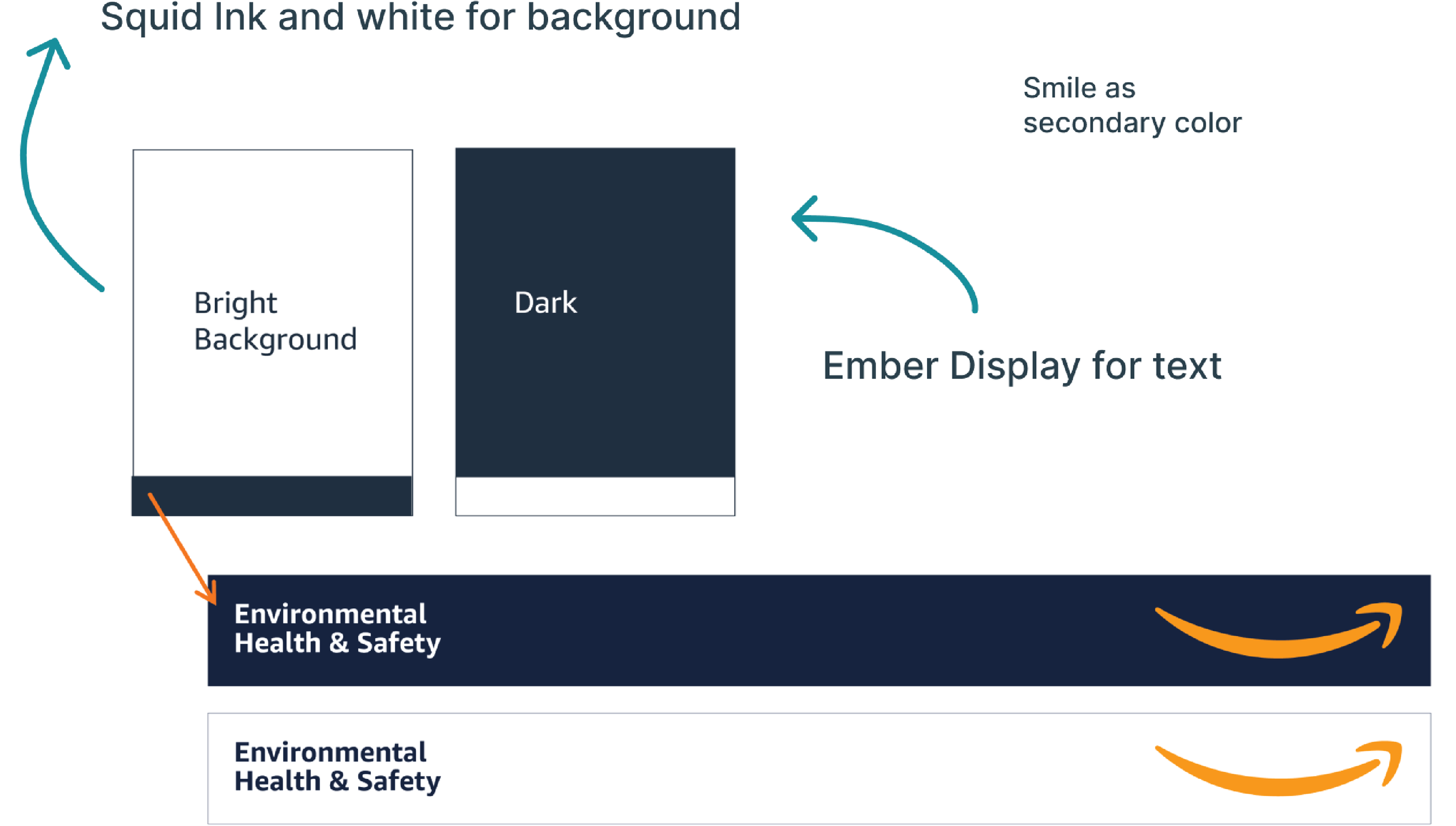

Designing for global audience
Design for easy translation, worldly reasonable symbols.
Illustrations that target every user, no matter culture, language, or location.
Expectations around volume of content. Some cultures prefer larger amounts of content and greater detail compared to other, so content-heavy signages like this should consider the volume of content expected by these users.


Feedback from stakeholder
“Her vision and creativity helped us create a new global brand by keeping image and design style consistent. She created icons, larger images, headers, footers, buttons, maps, and more. Her images can be seen by all corporate offices globally.
We could not have built our brand without her!”
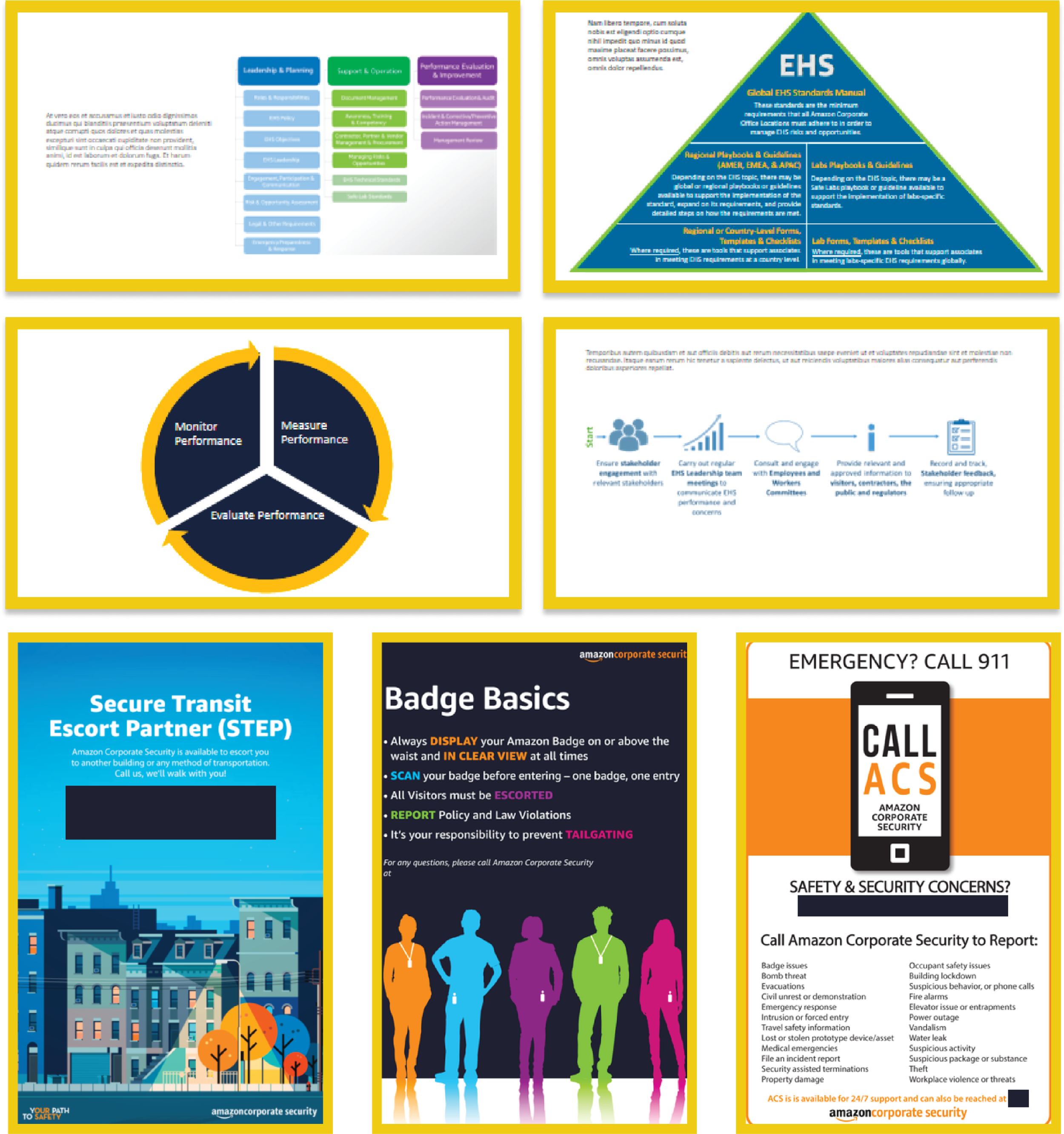
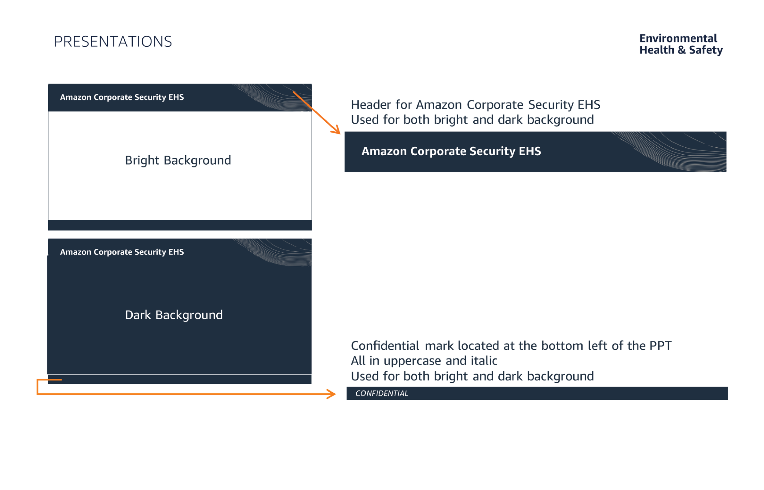
PowerPoint Guidelines + Before & Afters


Feedback from stakeholder
“At the onset, Maira took our simple, rudimentary information, and created beautiful, eye-catching informational signage. Also, she created dozens of unique graphics, and an entire brand identity with color pallet, and PowerPoint master slides.”
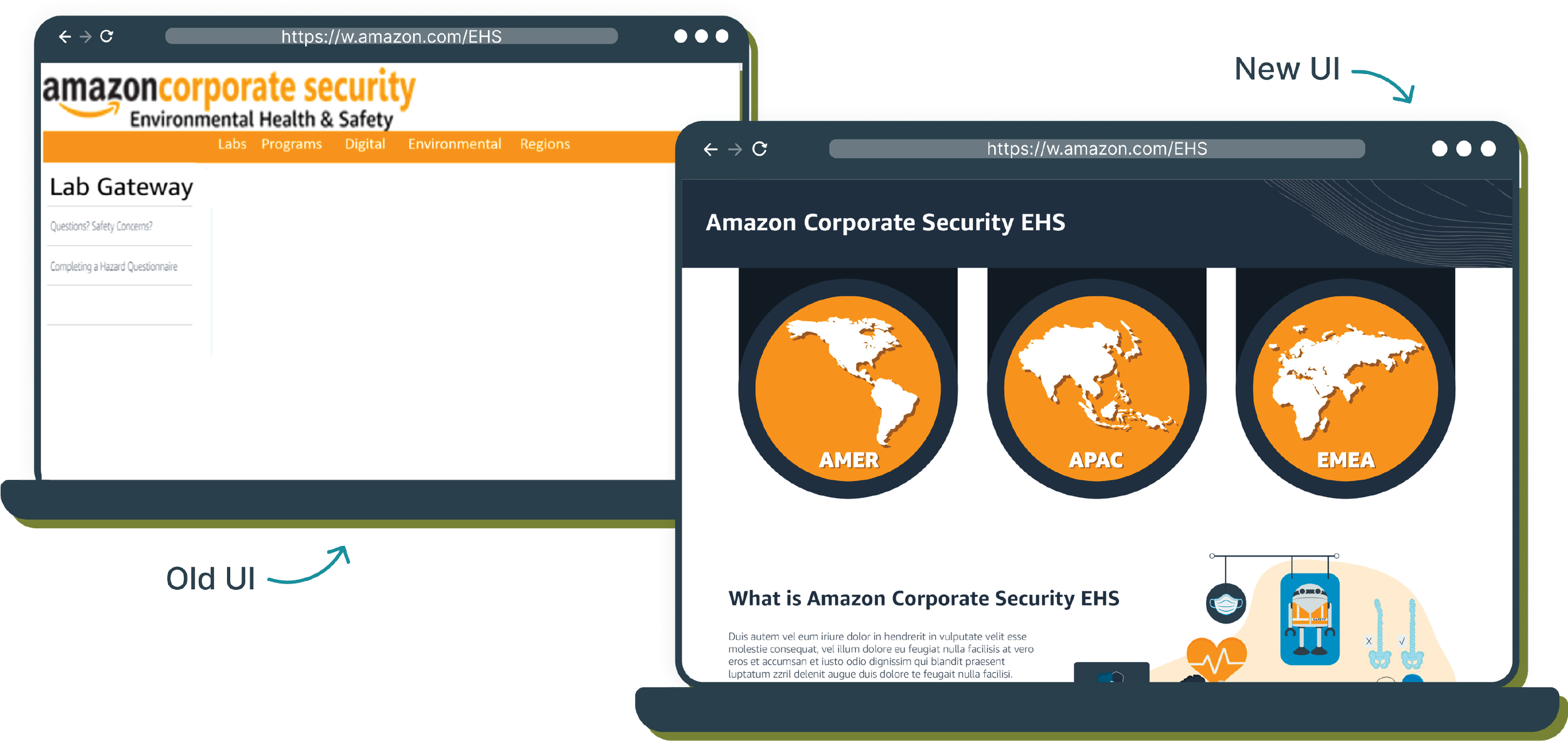
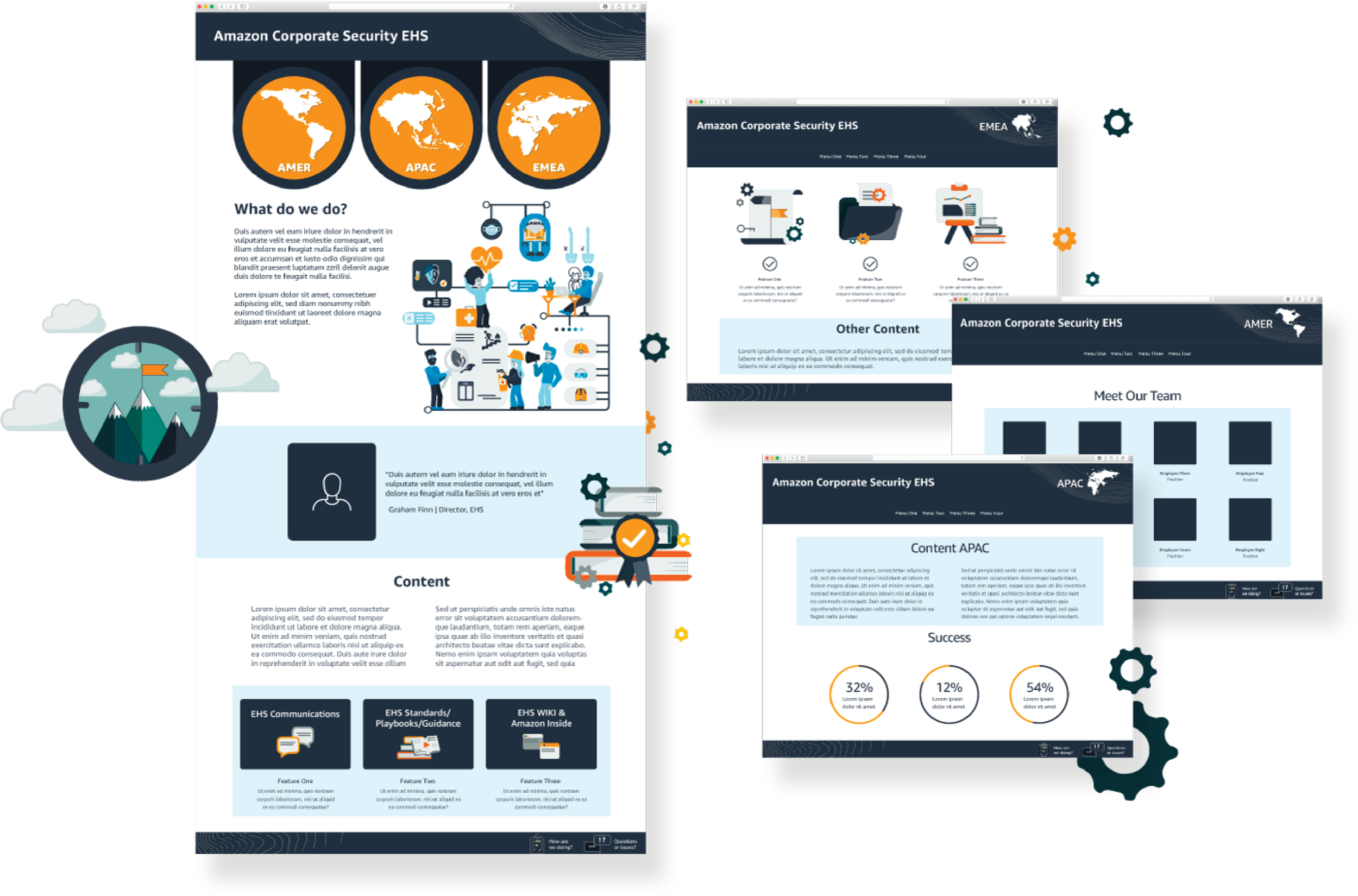
Problem 2
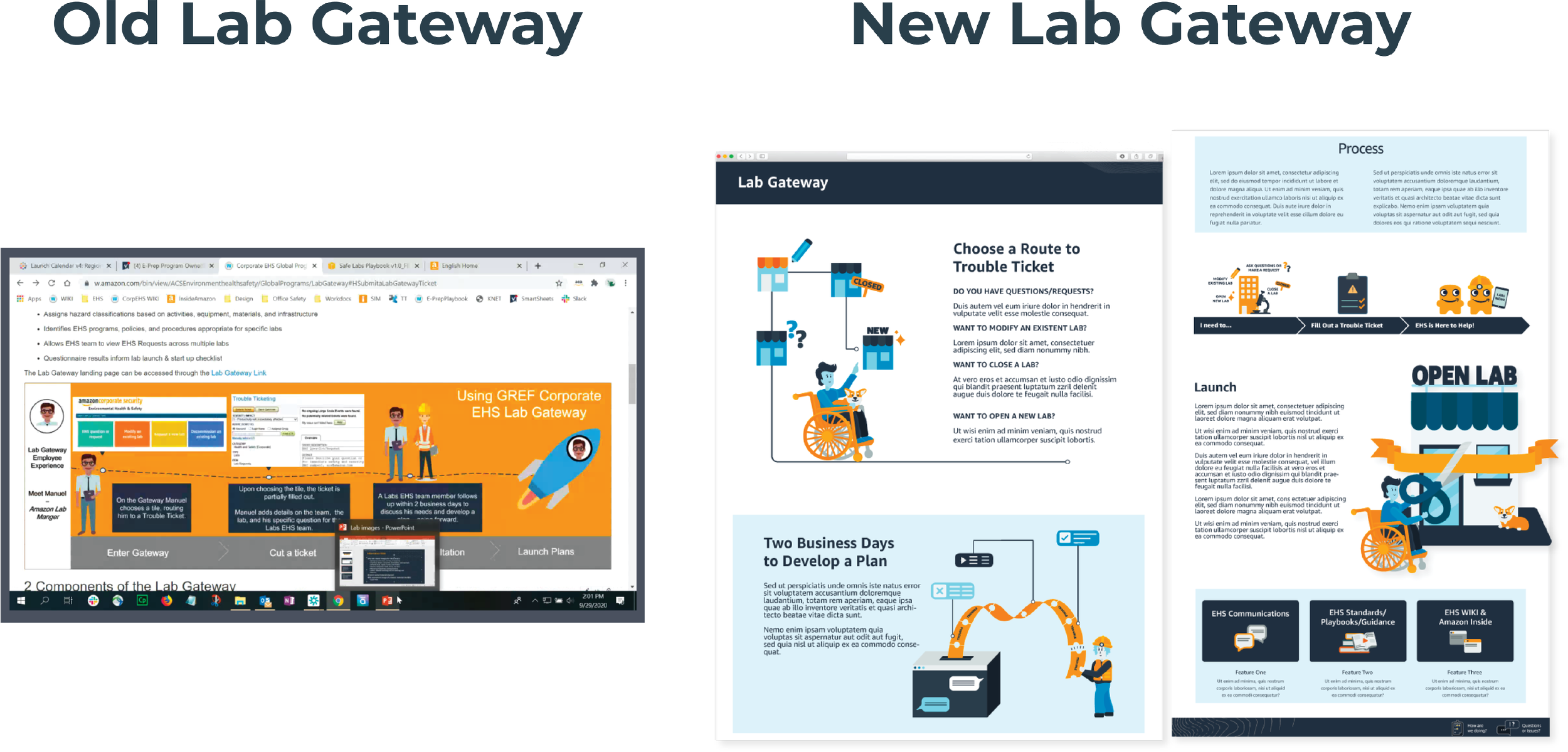
ANALYZING TROUBLE-TICKETS
At least half of the tickets could have been resolved if the requester knew the areas that EHS covered in their region.
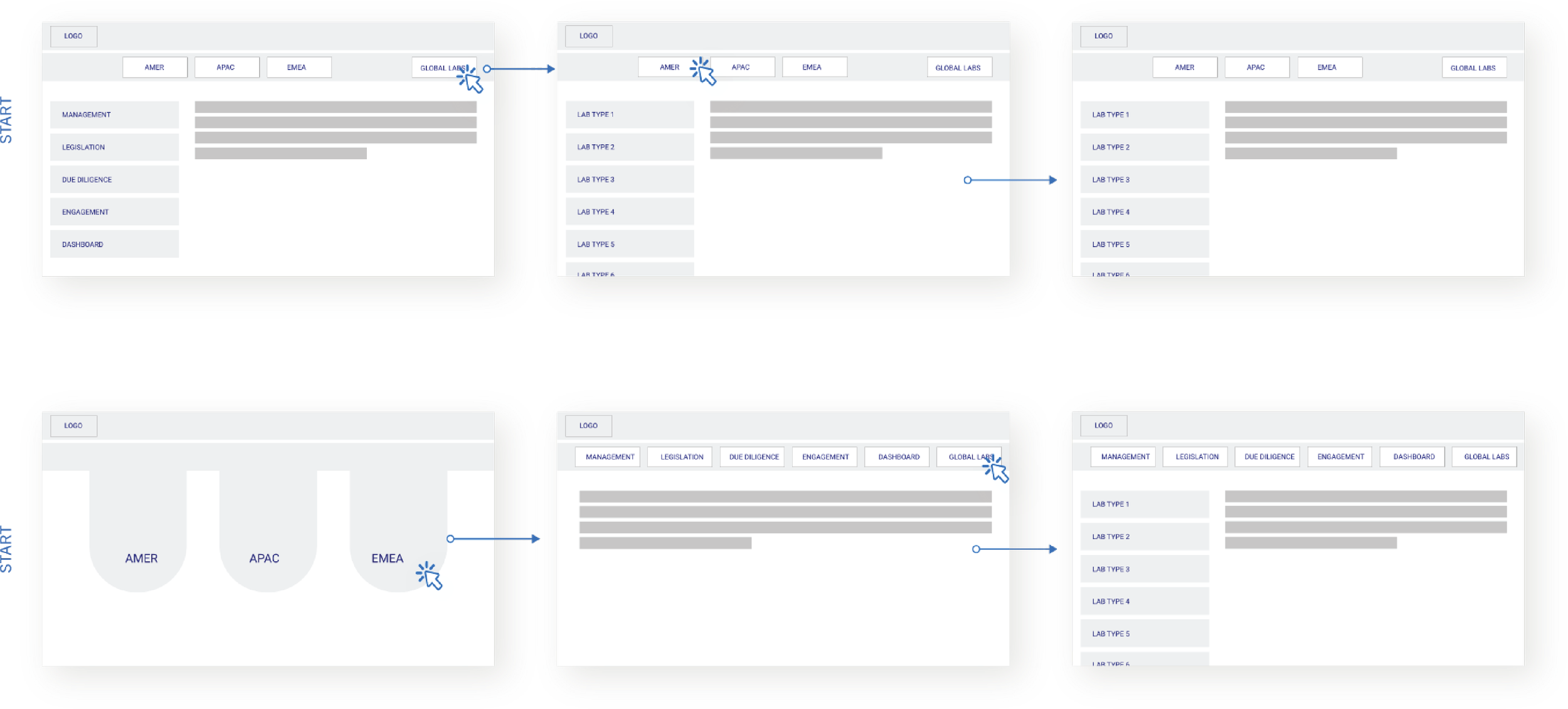
Conceptualize/Build Prototype
Direction 1 - Leadership wanted to keep a side menu
Direction 2 - Funnel down from regions with big CTAs
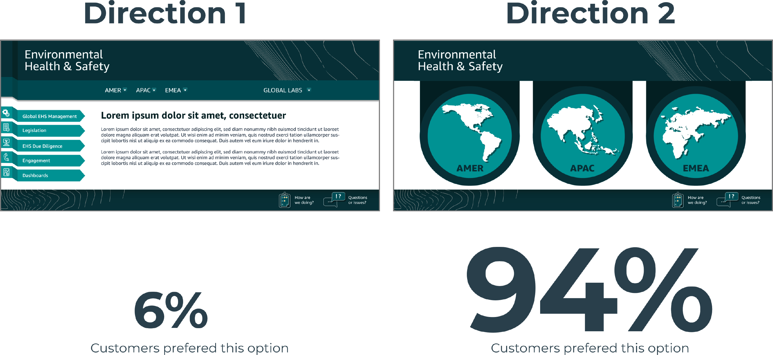

Feedback from stakeholder
“Maira is a creative and collaborative designer. She has completed many types of design requests that have been used for email communications, digital documents, templates, online training, presentations, and wiki materials that support a global rollout of standards.With her page redesign we have decreased the amount of trouble tickets. We love working with her”